

CASE STUDY
Elevating a Premium Ice Brand Into a Lifestyle Experience
We partnered with Quari Ice to reposition the brand essence, complete a website rebuild, and roll out a 6-month social media strategy that brings the product to life across hospitality and consumer touchpoints.


X
OVERVIEW




Client
INDUSTRY
Scope
Timeline
Quari Ice
Hospitality / Beverage
Rebrand, Website Rebuild, Social Media Strategy
6 Months
THE CHALLENGE
Quari Ice needed a brand experience that matched the product quality.
While the product delivered a luxury experience, the existing digital presence lacked the visual sophistication and strategic messaging needed to communicate the brand’s premium positioning.
Elevate the brand visually


Improve website UX and storytelling

Position as both hospitality supplier and lifestyle brand


DISCOVERY & STRATEGY
Defining the Premium Experience
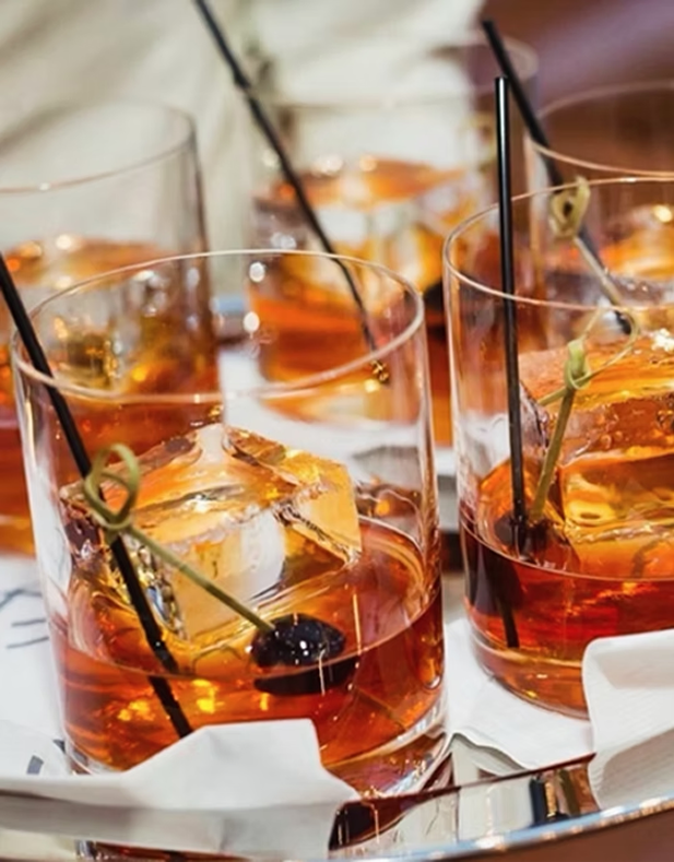
We uncovered key insights, analyzed the market, and defined a strategy that blends luxury hospitality with lifestyle appeal.
AUDIENCES
Restaurants & Bars
Hospitality Buyers
Cocktail Enthusiasts
Luxury Consumers
POSITIONING
One of life’s little luxuries that can be enjoyed by anyone.
STRATEGY
Cinematic visuals
Emphasize craftsmanship
Elevated hospitality aesthetic
Blend B2B credibility with lifestyle branding
“The new brand and digital experience showcase the quality of our ice and the experience we help create.”
-Quari
SOCIAL CAMPAIGN
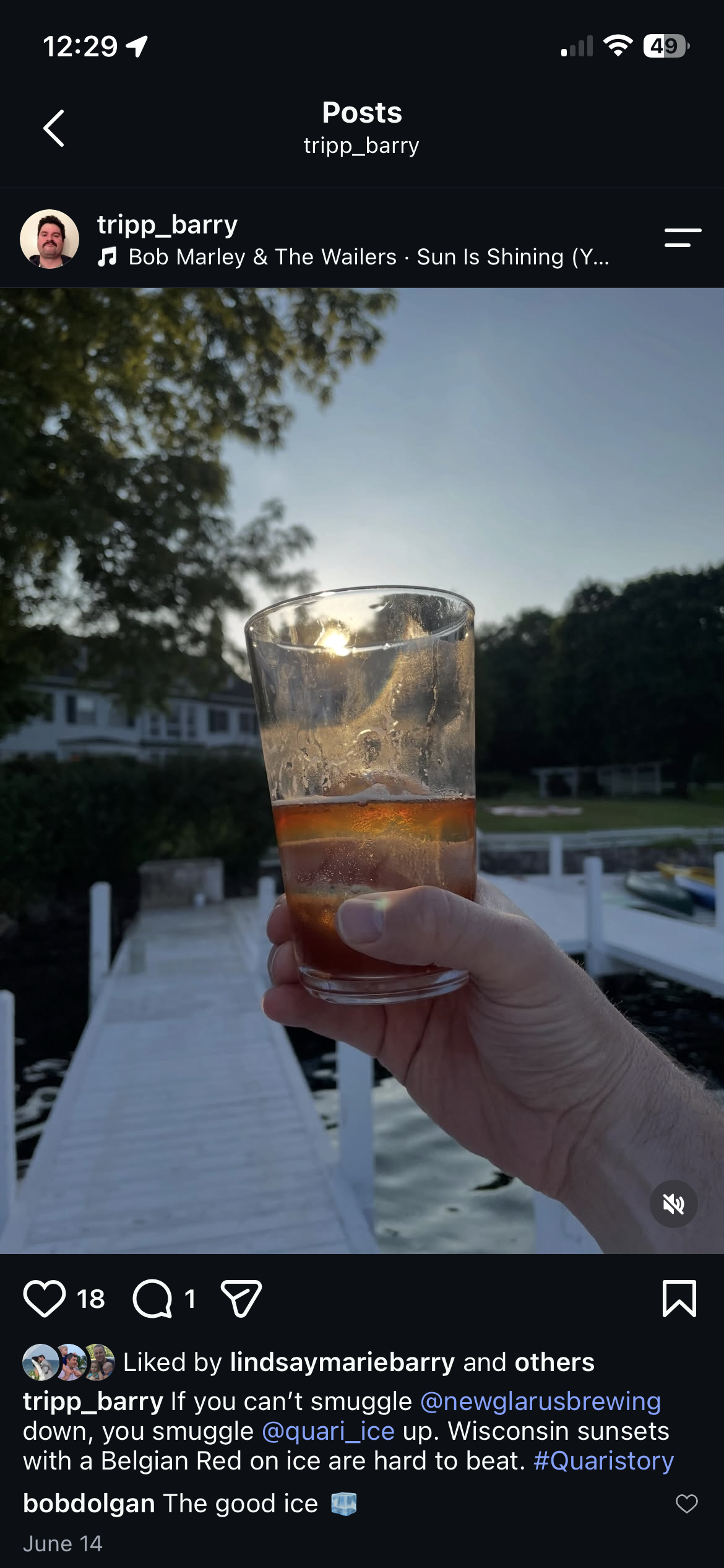
User Generated Content
No time to post? No problem. We convinced customers to post for us.
Encouraged everyone to share their #quaristory
Enticed UGC with free products
increase in online sales
+180%
WEBSITE REBUILD
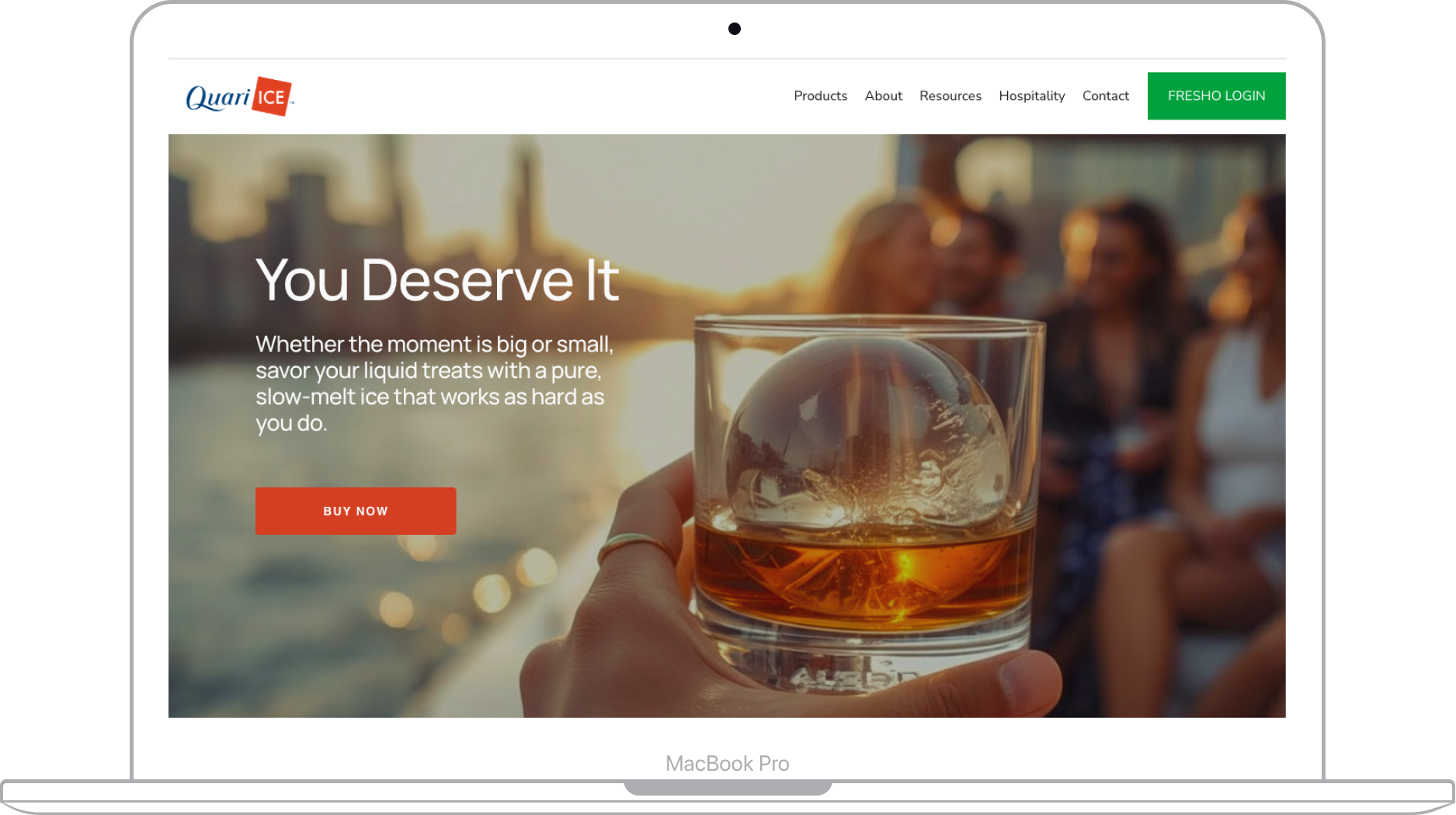
Built for Storytelling and Conversion
Clear user pathways for hospitality and consumers
Mobile-first responsive design
Strong visual hierarchy
Conversion-focused CTAs
THE RESULTS
The rebrand and digital refresh positioned Quari Ice as a premium lifestyle brand. The new website and social direction created a cohesive brand experience aligned with high-end hospitality expectations.


Stronger brand recognition

Improved user experience

Increased inquiries & engagement

Consistent premium brand perception
KEY TAKEAWAYS
Design for emotional perception
Balance B2B and consumer needs
Consistency builds trust and recognition
Strategic UX drives real business impact

Wut we do:
Content.
Creative.
Production.
Results.